Why a Toaster Is a Design Triumph
The “A Bit More” button doesn’t reinvent the appliance’s form. It finds its soul instead.
Last year I fell in love with a toaster.
It looks like most others. A brushed, stainless-steel housing. Four slots, to accommodate the whole family’s bread-provisioning needs. It is alluring but modest, perched atop the counter on proud haunches.
But at a time when industry promises disruptive innovation, Breville, the Australian manufacturer of my toaster, offers something truly new and useful through humility rather than pride.
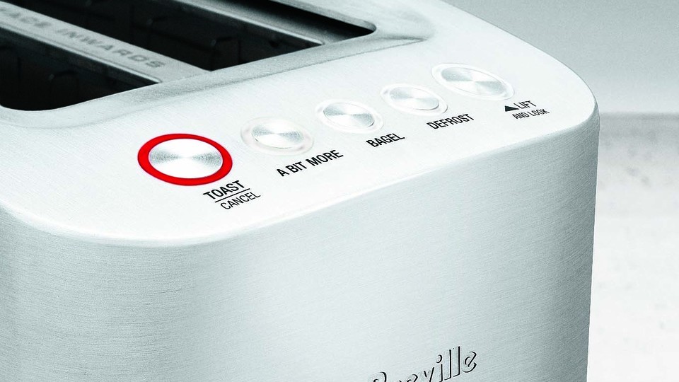
The mechanism that raises and lowers the bread from the chassis is motorized. After I press a button atop the frame, the basket silently lowers the bread into the device to become toast. On its own, this feature seems doomed to mechanical failure. But the risk is worthwhile to facilitate the toaster’s star ability: the “A Bit More” button. That modest attribute offers a lesson for design of all stripes—one that could make every designed object and experience better.
* * *
Toast is an imperfect art. Different breads brown at different rates. Even with the very same bread, similar toaster settings can produce varied results. When my bread doesn’t come up dark enough, I dial in a guess for another browning run. Usually I go overboard and burn the toast in the process. It’s toaster telephone game.
The “A Bit More” button enters here, at the friction point between good and great toast. When the toast reveals itself to me above the Breville’s chassis, I visually gauge its browness. If insufficient, I press the button, which actuates the basket motor. Down it goes for a brief, return visit to the coil. Then back up again, having been toasted, well, just a bit more.
The button also makes toasting bread, normally a quantitative act, more qualitative. The lever dials in numerical levels of browning, and the “A Bit More” button cuts it with you-know-what-I-mean ambiguity. That dance between numbers and feelings apologizes even for a slightly over-browned slice of toast by endearing the eater to the result the button helped produce.
Sure, I’m talking about toast. But Breville’s “A Bit More” Button is nothing short of brilliant. It highlights an obvious but still unseen problem with electric toasters, devices that have been around for more than a century. And then it solves that problem in an elegant way that is also delightful to use. It’s just the kind of solution that designers desperately hope to replicate, and users hope to discover in ordinary products. But agreeing on a method for accomplishing such achievements is harder.
The “A Bit More” Button was conceived by the industrial designer Keith Hensel, who worked for Sunbeam and then as Breville’s principal designer until his unexpected death in 2013, at the age of 47. His specialty was household products, like toasters, kettles, and blenders.
Breville’s head designer, Richard Hoare, tells me that Hensel, with whom he worked closely, fell upon the idea by “focusing on user empathy.” Hensel had been pondering the problem people have with toasters. “Your bread comes up too light, so you put it back down, then get distracted and forget, and it goes through a full cycle and burns,” Hoare relates. “Keith thought, why can’t the consumer have more control? Why can’t they have ‘A Bit More?’”
According to Hoare, the design team called the button by that name from the start. Some people within Breville thought it was too colloquial, and other options were considered. “Extra Darkness” was one, and “10% Extra” another. “These were confusing and clunky,” says Hoare. “In the end ‘A Bit More’ was the clearest.” Breville, which holds several patents in motorized toaster basket tech, started selling toasters with the feature in 2008.
When it came to persuading Breville to adopt and manufacture the idea, Hoare admits that it took some time for people to see the significance. I imagined that manufacturing cost and complexity might have been a factor, but Hoare waves that off. Instead, he tells me that describing features in a way ordinary users might, rather than by means of brand-speak, had sparked debate between design and marketing. The design team insisted that the colloquial version would resonate with users. “We have had so many say, ‘I love that it’s actually called A Bit More,’” says Hoare. “‘It was so cool when I saw it printed there next to the button.’”
* * *
The explanation elicits nods of respect. This, it seems, is how good design happens. But how would a designer, or a business, or even an ordinary person replicate the triumph of “A Bit More” in other contexts?
Hoare’s recollection corresponds with a trend in contemporary design practice—and one that claims to be particularly adept at producing outcomes like “A Bit More.” It’s called user-experience, or UX, design, a discipline that strives to craft pleasurable and useful encounters between people and things. Originally derived from human-computer interaction, or HCI, where user-interface design was its ancestor, UX purports to offer a general approach to design of all kinds, from software design to product design to architecture and urban planning.
But UX practice talks out of both sides of its mouth. On the one hand, UX fancies itself an empirical discipline. Its processes include ethnographic user research, specification drafting, iterative design, user testing, and so forth. UX inherits mid-century form-follows-function design ideals. It also embraces more recent trends, like participatory design, which deeply integrates stakeholders into the design process. Data are often incorporated into UX for affirming, denying, or directing elsewhere a design team’s attention.
On the other hand, UX design also privileges out-of-the-box genius to solve design problems. Apple, often considered to typify UX, is famous for conducting design in secret via a small cadre of geniuses. Steve Jobs is the ultimate example, a figure who held that “people don’t know what they want until you show it to them.” In the design-genius mentality, how a toaster (or smartphone, or building) ought to work becomes a type of soothsaying, whereby the designer earns the status of mastermind. Research becomes retrospective justification, the designer’s ingenuity validated by user adoption of the product—irrespective of how well it really serves their goals or interests.
Neither polarity of UX-style design really helps explain how one might best arrive at Breville’s “A Bit More” button. On one side is intuition. Keith Hensel, the genius who died too soon, possessed a sixth sense for taming the Maillard reaction and a congenial manner for proselytizing his solution. On the other side is evidence, via the research and participant observation conducted to cash out the “user empathy” Hoare cites as a compass bearing.
UX proponents tell tall tales about how good design really takes place. Bottom-up, evidentiary design implies that the designer is ultimately unnecessary, a mere facilitator who draws out a solution from the collective. The designer becomes a bureaucrat. And top-down, genius design becomes indistinguishable from salesmanship. As a result, design dissolves into other, more established disciplines like business intelligence, product marketing, and corporate evangelism. It’s an error that makes good design look far easier and more replicable than it really is. And worse, it allows people to conclude that their own expertise—from data analytics to advertising to illustration—is a sufficient stand-in for design.
* * *
The error comes from two assumptions. The first holds that human beings are the only arbiters of designed objects and experiences. A design is good if it works for humans, even if individual humans might disagree about what that means. In this conception, design is a purely instrumental process, carrying out human will with ever-increasing refinement.
But design-by-genius proves that this approach is often flawed. Jobs was right: People don’t seem to know what they want, or need. Who could imagine verbalizing even the relatively simple challenge of toasting such that the “A Bit More” button would emerge as a remedy? Some UX proponents have realized this trap and reframed their design practice as a dialectic between the gifted and the rabble. But soon enough, the resulting compromises again feel like a smorgasbord of every possible influence, from management to technology to sociology. Design becomes a nickname for any possible approach to design, which reduces it to a shibboleth for designers.
The second erroneous assumption is that contemporary designers believe they are reformers. Agents of change. It could be social or political change. It could be aesthetic or cultural change. It could be the selfish change of professional aspiration and its related station. It could be the change associated with progress. Designers are ambitious sorts of folk—arrogant, even—and none would want to be associated with stasis, or even with mere cyclicality. What a waste, just to mow lawns or brown bread every day! Let us instead reinvent lawn care! Let us reinvent breakfast!
But neither Hensel nor Hoare adopt such hubris over toasters. Breville’s toaster is not remarkable because it reinvents toasting, nor because it resolves an obvious user grievance, nor because it changes the world. What makes the device compelling is that it makes toasting what it always was, but even more so. Everything remains the same, but ever so slightly adjusted. Trim-tab-tweaked to more adeptly sail the current tack, the same one all bread-browners have navigated since the advent of the electric toaster.
Counterintuitively, design is a process conducted for the benefit of human use, but which takes place outside the domain of human experience. Unlike politics, entertainment, health, and other domains that also impact human life directly, design exerts force on the material world before the human one. (Design shares this quirk with engineering, but engineers are fortunate enough to work at technical depths, where ordinary people can’t see.)
To design a toaster (or a building, or a smartphone) effectively, the designer must depart the realm of the human, at least temporarily, and enter the universe of the object. Despite what the UX folk might say, designers are not diplomats negotiating treaties between humanity and toasterdom. Instead, they are explorers who breach the alien frontier of toasterness. Certainly, that cosmos does not exclude the human agents who would brown bread for sustenance. But it does not rely upon them exclusively, either. Toasting is a practice bigger than people and toasters both, otherwise it would be possible without one party or the other.
* * *
Allow me to indulge an analogy from philosophy. In both the genius and consensus registers, UX design predicates its success on knowledge: either the second sight of the designer, or the negotiated consensus of the user. Philosophers call the study of knowledge epistemology, and this approach to design is entirely epistemological. Just find the proper knowledge and the right design will emerge.
But when conducted best—including in Breville’s case, and despite Hoare’s insistence otherwise—design is more related to the philosophy of what things are, called ontology. It is a discipline of essence, that great bugbear of contemporary life, not of knowledge. Pursuing greater compatibility with a thing’s essence requires that the designer focus on the abstraction formed by the designed object and its human users together—whether it be toasting, dwelling, publishing, socializing, or anything else.
The designer’s job is not to please or comfort the user, but to make an object even more what it already is. Design is the stewardship of essence—not the pursuit of utility, or delight, or form. This is the orientation that produces solutions like the Breville “A Bit More” button. The design opportunities that would otherwise go unnoticed emerge not from what people know about or desire for toasting, but from deeply pursuing the nature of toasting itself.
The distinction might seem academic. Isn’t the UX-oriented toaster designer simply seeking deeper knowledge of the essence of toasting? Doesn’t the designer-genius simply have special, immediate access to that deep nature? Indeed, that’s possible. But mostly through accident. The designer who starts from the problem of knowledge will only ever find essence by happenstance. And that is why so few things feel like the “A Bit More” button. They are struggling so hard to meet requirements, please people, or exalt the arbitrary choices of their creators that they fail to pay respect to the thing in question—and thereby to see what it is, even, let alone to change it for the better.