


Design dictionary
A
A/B test
Common in designing and developing for the web, A/B Testing is the experimentation of two or more design, copy, or other types of content versions to see which one performs better based on determined success metrics. These versions are shown to different visitors to your website to compare the results of the two or more groups.
For example, you have a hypothesis that the call-to-action button on your website could be improved to increase button clicks or taps. You test this hypothesis by displaying the text, "Get Started" on the button to half of the visitors to your website, and, "Start Today" to the other half of the visitors.
It is smart to maintain a control group, that doesn't see any changes to your website, to better plan for anomalies or other changes in your web traffic. This can be the "A" in your A/B test, introducing just one new version (B), or you can have a control version and any number of additional variations to compare it to.
Accessibility
The degree to which your product is inclusive of and usable by the broadest range of individuals. We see this in our physical spaces, with a ramp for an individual with temporary or permanent limited mobility to use instead of stairs. And while an individual that needs a ramp to access a building is helped, an individual that may have taken the stairs can also use and benefit from a ramp.
Aesthetic-usability effect
A phenomenon in which people believe a more aesthetically pleasing product is easier to use than a less-aesthetic design — even if it’s not easier to use.
This is similar to attractiveness bias, which is often referenced when discussing the United States presidential election of John F. Kennedy v. Richard Nixon.
Aesthetics
The philosophy of exploring the perceptions of beauty and artistic taste, with a focus on how our minds react when we perceive art in any form, such as music, poetry, sculpture, and more. It is a study of how we feel about art, discerning what we do and don't like, and how it can affect us emotionally.
Agile
A methodology or process for managing projects and organizing work, widely adopted in software development.
Work is conducted in a series of sprints, usually across functional teams within an organization brought together to collaborate on solving a problem or problem set. The process requires that products are iterated on frequently to respond to changing requirements, markets, focus, or customer needs.
See the origins of Agile in the Manifesto for Software Development.
Alignment
An element of organizing visual elements, alignment is a critical concept in building consistency and hierarchy in a composition. An effective design practice to visually define lines, spaces, or to draw a viewer's focus. The absence of alignment can also be used to attract attention.
There are several types of alignment. With objects, the options of alignment are vertically center, horizontally center, top-aligned, right-aligned, bottom-aligned, and left-aligned. With text elements, left-aligned is also known as left justified and ragged right, right-aligned is also known as right justified and ragged left. Type can also be aligned top, center, and bottom within a text box.
Optical alignment is when objects or text are adjusted to be perceived as if they are in alignment with other objects or margins. This may be necessary with shapes and letters that don't have straight edges, such as circles and triangles or angular letters like A, V, W, and Y.
Alt text
Short for alternative text, and also known as alt tag, alt description, and alt attributes, it is code within a webpage or app used to provide a meaningful description of what an image communicates. Alt text is exposed by screen readers and may be crucial for individuals navigating your page or product with reduced vision.
In programming, it should be applied to every image within the HTML code by including an alt tag. It should be added even if the image is decorative, in which case the tag should be empty.
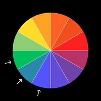
Analogous
In color theory, analogous color schemes are sets of three colors next to each other on the color wheel.
They are typically two colors from the primary or secondary color schemes, with the third color being a mix of the dominant two. For example, blue, green, and blue-green.
It is essential that analogous color sets have enough contrast for accessibility.

Appendix
A section at the end of a book, document, or other reading material that offers additional information on the contents of or sources referenced in the text. An appendix usually provides additional context to explain a topic further and can contain bibliographic data.
Ascender
In typography, an ascender is a part of a lowercase letter that rises above the x-height of the typeface, such as in the letters b, d, f, h, k, l, t.
Together with descenders, these typographic characteristics can increase legibility.

Aspect ratio
The relationship of the width in proportion to the height of an image, Frame, or screen. For example, 16:9, a conventional aspect ratio used by high definition (HD) televisions that have a resolution of 1920x1080. 4:3 and 3:4 are aspect ratios that are commonly used in photography.
The iPhone X screen is 375 points wide and 812 points tall (1125x2436 pixels), making it a 9:19.5 aspect ratio.
Read more: https://wikipedia.org/wiki/Aspect_ratio_(image)
B
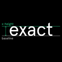
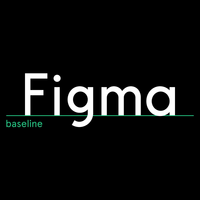
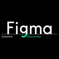
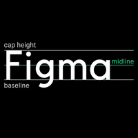
Baseline
In typography, a line that runs along the bottom of text which the letters “sit” upon. For most typefaces, characters that have descenders, like g or j, extend below the baseline. Some characters overlap the baseline only slightly, like o or a, as seen in this image with the “a” in Figma.

Bibliography
Found in the appendix of books and written documents, it is a list of references and sources utilized for the research and creation of the text.
Bitmap
A raster graphics image file format where each pixel, or "bit," is defined by a single color. All the bits combined together are arranged to make up the larger image. The "map" part of the name references the dimensions of the image and the instructions for how the bits are arranged.
Boolean operation
In design, the functions Union, Subtract, Intersect, and Exclude are used to combine vector objects in different ways.
Boolean Operations originated in mathematical logic using combinations of True and False. Boolean logic is commonly used in computer programming.
See how Boolean Operations are used when designing in this video.
Bowl
In typography, the curved stroke of a letter, glyph, or numeral that encloses a space. Such as in lowercase letters a, b, d, g, o, p, and q, the capital letters B, D, O, P, and Q, as well as the numerals 0, 6, 8, and 9.
A larger sized bowl can increase readability, especially when set in smaller type sizes.

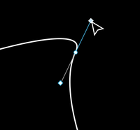
Bézier curve
A path connecting two vector points that is not straight. Originating in mathematics, this graphic element is one of the fundamental aspects of drawing vector shapes and lines.
Bézier Curves are created and manipulated with the Pen Tool and Bend Tool.
Bézier Curves are also used in animation to determine the velocity of an object's movement over time.

C
Colophon
In printing, it is a brief statement in the front or back of a book containing information about the authorship, place and date of publication, the publisher, and/or printing materials such as paper stock and typefaces used in the production of the book.
Color vision deficiency
A condition where a person’s eyes are unable to see colors in common light situations. People with color vision deficiency have a hard time telling colors apart. Most people who suffer from color vision deficiency are not blind to color but have a reduced ability to see them. However, the most severe forms of these deficiencies are referred to as color blindness.
Copy
The written material for a design. This is the non-placeholder text that is used for headings, subheading, body text, or other written elements of a product. It is the output of Copywriters, Copy Editors, or Content Producers, and sometimes is written by Product Managers, Designers, or other stakeholders.
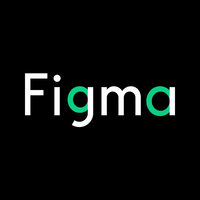
Counter
In typography, the enclosed space within a letter, glyph, or numeral. Such as in almost every letter and number with exceptions like i, l, and 1.
When counters are enclosed by curved strokes, the strokes are called bowls.
A counter that is not fully enclosed is sometimes referred to as an Open Counter, as seen in the "F," "g," and "m."
The size of a counter can affect readability, and can become identifying factors in a typeface.

Customer journey
The story that your customers experience as they move through while interacting with your product, company, and brand. Instead of looking at just a part of an experience, the customer journey documents the full experience of being a customer. This is the focus area of User Experience (UX) Design.
D
Descender
In typography, a descender is a letter where part of it extends below the baseline, such as the lowercase g, j, p, q, and y in most typefaces.
Some typefaces also have numbers that descend below the baseline, such as the numbers 3, 4, 5, 7, and 9 in Balthazar. This is called an old-style numeral.

Design brief
A design brief is a document used to outline the key elements and deliverables for creative work. It is a helpful document to reference throughout the design process and helps to focus and clarify the project as it evolves.
Design system
A series of components and elements intended to be reused in different combinations to maintain consistency across products and teams.
A design system can help manage the designing and building of products and interfaces at scale.
See designsystems.com for more inspiration.
E
Empathy
The ability to understand the world through other people’s eyes — and put aside our own biases as we do so.
Exposure
Gaining attention or notoriety for work that is published or shared.
Do not work for exposure. Exposure is not a valid form of payment.
F
Fluent Design System
A popular design system by Microsoft that helps individuals and teams design software and digital experiences for Windows and Xbox devices and platforms.
The Fluent Design System offers guidance for visual language and interactions and is emphasizes five key components: Depth, Light, Material, Motion, and Scale.
System and resources available at microsoft.com/design/fluent.
See also Human Interface Guidelines and Material Design.

Font
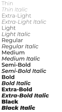
A file for installing and using a set of type in a particular weight and style.
In a typeface, for example Montserrat by Julieta Ulanovsky and studio, there are multiple styles and weights — such as regular, bold, italic, thin, black, etc. — and each has a font. A typeface with multiple weights has a font for each weight, together they are known as a font family.
Font family
A typeface with multiple weights, that each have a font, together make up a font family.
The typeface Montserrat has a font family of 18 fonts: Thin, Thin Italic, Extra-Light, Extra-Light Italic, Light, Light Italic, Regular, Regular Italic, Medium, Medium Italic, Semi-Bold, Semi-Bold Italic, Bold, Bold Italic, Extra-Bold, Extra-Bold Italic, Black, and Black Italic.
Image from Google Fonts.

G
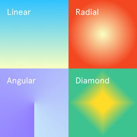
Gradient
Also known as a color gradient, color progression, or color ramp.
Gradients are compromised of at least two colors gradually transitioning between each other to fill a shape or area. Alternatively, one or more of the colors is instead a transparent fill, not a color fill.
Four common types of gradients are linear, radial, angular, and diamond, although linear and radial are represented most frequently.

Gutter
The space between two columns containing text or other elements. Similar to margins, gutters help increase the readability of columns of information.
H
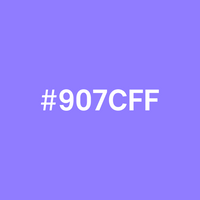
HEX value
HEX is an abbreviation of hexadecimal.
This color code tells computers and devices which color to display using three pairs of digitals, representing the red, green, and blue RGB values. The code starts with a pound sign (#) and is followed by six hex values or three hex value pairs made up of numbers 0-9 and letters A-F. For example, #907CFF renders as a purple color and is shorter to write than the RGB combination it represents, 144, 124, 255.
HEX values are commonly used for the web in HTML and CSS code.

Hero image
A large graphic or image that leads people into a layout and sets an emotional tone, typically seen in web design. A hero image is generally the first thing visitors to a web page see and suggest context, product information, or aesthetic tone.
Hierarchy
Hierarchy is the organization or presentation of elements in a way that suggests importance. The arrangement and emphasis of visible elements influence the order in which the human eye perceives what it is seeing. This order of dominance is created by the visual contrast between objects and the principles of Gestalt philosophy.
Human Interface Guidelines
Documentation by Apple for modeling design and development practices for improving the user experience of app interfaces to be more consistent and intuitive.
The Human Interface Guidelines contain modules of information regarding multiple platforms and aspects of interaction as well as UI resources and guidance for designing experiences and layouts consistent with Apple's platform of operating systems.
System and resources available at developer.apple.com/design
See also Material Design.

I
Inclusion
Designing services or products to be accessible to, and usable by, as many individuals or groups as reasonably possible while helping to meet the needs of excluded people. Consequently, designing inclusively often improves the product experience for all of your customers.
Index
An alphabetical list of topics such as names, places, or core concepts in written materials such as non-fiction books, articles, and reports alongside the page number(s) that the specific topics appear.
An index found at the beginning of written work is referred to as a table of contents and is often briefer than those found at the end of a text.
Iteration
A method of continuing to improve a product or outcome after an initial version is created and shipped. Iteration is used to refine a product to better achieve desired goals or results, using the additional time and research gained from having launched a version already.
J
Justified
A concept of alignment specific to blocks or line of text.
Left justified is when the beginning of each line of text starts at the same x value along a left margin. This is also known as left-aligned, and it creates a rag on the right.
Right justified is when the end of each line of text is flush against a right margin. This is also known as right-aligned, and it creates a rag on the left.
Full justified is when both the left and right ends of lines of text are flush to both sides of the text box. Letter-spacing and word-spacing are adjusted to set each line of text to a consistent width. There is no rag with full justification.
Centered text is the absence of justification.
K
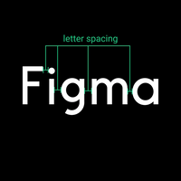
Kerning
In typography, the adjustment of space between two characters of text. Increasing or decreasing letter-spacing so that the characters in a word, wordmark, or line of text look evenly distributed optically.
Fonts are constructed so that any two or more characters can be placed next to each other. Sometimes the space around a character is set in a way that it looks further apart or closer together to it's neighboring characters. Kerning is the process of adjusting that spacing between letters to make the distribution of letters and the space between them appear even.
L
Leading
In typography, the adjustment of space between two lines of text vertically. Increasing or decreasing line height can help to improve or reduce readability.
Leading is measured from the text's baselines. Generally, setting the line height between 1.1 and 1.2 times the font size (110%–120%) results in readable text, but every typeface has nuances — including line-spacing.
Long lines of text, bold set type, type set at small sizes, and sans serif typefaces may require more leading.
Legibility
In typography, legibility is the measure of how easily an individual can distinguish letters, characters, glyphs, lines, words, or paragraphs from each other, allowing writing to be read or deciphered.
An increase in type legibility can help increase readability.
Letter case
Also referred to as “case,” is the distinction between smaller letters like lowercase and larger letters like uppercase or capital letters. Most typeface sets have letters in both, while fonts like Bangers are set in just uppercase. Typefaces set in only uppercase letters or only lowercase letters are less common.
Title case, all lowercase, sentence case, all caps, and small caps are all different types of letter case.
Letter-spacing
In typography, the style of a typeface that defines the space between characters in a word, line of text, or paragraph. The density of letter-spacing can contribute to readability and identifiability of a typeface or wordmark.
Letter-spacing is adjusted through kerning.

Logo
A symbol for representing or identifying a product, organization, company or brand.
Lorem ipsum
Text comprised of fake words used for placeholder text to show the visual form of a text block or document without relying on real content. This allows designers to focus on the form before the content and is often used when the actual content is not yet available.
Lorem Ipsum comes in many forms, check out meettheipsums.com to see more.

M
Margin
The buffer region around the inside edges of a Frame, screen, page, document, or other composition and the content within. Margins are typical structural elements in both web design and the print industry. They help define object alignment and text justification.
Margins can help increase readability and usability by adding white space to a layout.

Material Design
A popular design system by Google that helps individuals and teams build digital experiences, primarily for the Android operating system, but also aids in the creation of web and mobile experiences.
Material Design offers guidance for designing grid-based layouts, animations and transitions, padding, responsive compositions, dimensional depth effects, and more. It was named for its style of "card" motifs and physical paper materials.
System and resources are available at material.io.
See also Human Interface Guidelines.

Midline
In typography, a distance halfway between the baseline and cap height; also known as the mean line.
In some typefaces the midline marks the top of the x-height.

Mood board
A collection of sample imagery, colors, and other products to help express the desired aesthetic of a planned project. Mood boards can be helpful in conveying visual ideas using other visual elements. Often the elements complement each other in some way, such as color or style.
N
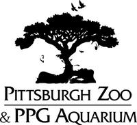
Negative space
The space around or between objects, elements, or forms that creates a form itself. For example, the Pittsburgh Zoo logo is a tree with a gorilla and lion formed within the negative space.
Negative space is commonly confused with white space, which provides breathing space for design elements in a composition.

O
Open-source
The process of making the original code, design, or other types of source file available for reuse, modification, or redistribution for free. Ordinarily used to describe software, more designers are creating open-source files and resources.
P
Padding
Space around an element's content.
Padding is used in web design in conjunction with margins to determine the spacing between objects and their location on your screen.
Pixel
Pixel is derived from the phrase picture elements. Each element of the picture serves as a building block in the screen’s grid. Each pixel has a unique location indicated by a set of coordinates. It also has the capacity to broadcast millions of colors.
The number of pixels in an image or display determines how the image looks. Display resolution indicates how many pixels are contained in a screen. So, a 1080x1920 display is just a grid that’s 1080 pixels tall and 1920 pixels wide. To calculate the number of pixels in a display, multiply the height of the grid by the width.
The number of bits used to represent a pixel determines how many colors it can display. So, an 8-bit pixel only allows for 256 colors, while a 24-bit pixel displays 16,777,216 colors!
Pixelation
Pixelation occurs most frequently in images with a low number of pixels per inch (PPI), also known as the resolution of an image, but also happens if there’s a low bit-per-pixel rate (the amount of data representing in the pixel).
Raster images are made up of individual dots of color arranged in a grid. As an image gets enlarged, it’s impossible to add more pixels. Pixels are stretched to the point they become visible, or pixelated.
Points
A standard measurement in typography for length, leading, font size, or other units. A point represents a square group of pixels and differs depending on the resolution of an image or display. For example, an iPhone X screen is 375 points wide, representing 1125 pixels at 3x. Since a point is always square, in this example the point is made up of nine pixels, a grid of three pixels wide by three pixels tall.
Points are traditionally the measurement unit used in print design. A point is .35 millimeters (1/72 inch) on a printed page.
Point is abbreviated as "pt."
Prototype
A mock-up or demo of what a product will look like often used to test a concept, then iterate from. Prototypes can be interactive to represent an experience before committing to developing or visual design polish. See also Wireframe.
Watch this short video on prototyping with Figma: youtube.com/watch?v=-sAAa-CCOcg
R
Raster graphics
Also known as pixel-based graphics or bitmap images, raster graphics are digital images composed of a grid of pixels. As raster graphics are scaled up, quality decreases because they are dependent on resolution.
Raster image files are generally larger in size than vector graphic files.
Common raster file formats are JPEG, PNG, GIF, and PSD.
Readability
The ease in which an individual can read and understand written text. In design, this becomes significantly more important for larger amounts of text or reading.
Readability can be increased through many different strategies, from higher contrast colors, larger text, shorter line length, kerning, leading, typeface choices, and more.
Readability is vital for every design and can be crucial for accessible design and especially important for individuals who do not have high reading comprehension.
While readability is typically used in reference to text, it can also apply to an image, an interface, or other visual elements. For example, an image with low contrast could be considered, "not very readable."
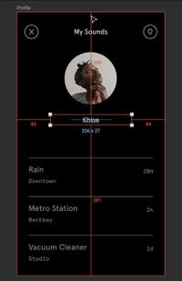
Redlining
An approach for designers to communicate and document their intentions for developer handoff. Redlining allows a programmer to understand the critical elements of a design such as the distance between objects, colors, fonts, object sizes, and more. Designers can write notes that point to specific objects to help clarify their intended behaviors that may be hard to comprehend from a design file.
Read about redlining in Figma.

S
Sans serif
A category of typefaces defined by the style of its letters. Sans Serif letters do not have embellishments on the end of the strokes, like with Serif letterforms. Sans means "Without."
Sans Serif text was commonly reserved for headings and large text but has become increasingly popular to use, even for long-form text. It is recommended that Serif typefaces are used for long-form text, as it is easier to read in large amounts.
Letters that include these stroke cap embellishments are Serif type.
Scrum
A method for the Agile process of solving complex problems and getting work done iteratively, primarily used in the development of software products. The scrum process framework includes cycles of planning, sprints, daily or weekly meetings, reviews, retrospectives, and a collection of incomplete work in a backlog.
It is partly defined by its low overhead, meant to reduce the amount of time consumed, and optimized for productive, useful actions.
The term came from Rugby, where players engage with their opponents to restart play and try to gain possession of the ball. In other words, a collaborative meeting to address problems head on and attempt to solve a problem.
Read more about Scrum at scrum.org/resources/what-is-scrum
Serif
A category of typefaces defined by the style of its letters. Serif type has embellishments on the end of the strokes that make up a letterform. Serif text may make more substantial amounts of text easier to read and is often used in books and newspapers.
Letters with a lack of these visible projections are referred to as a Sans Serif, sans meaning without.
More about letterforms: wikipedia.org/wiki/serif
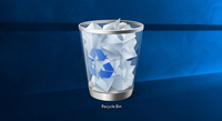
Skeuomorphism
In digital design, a style that mimics materials and dimensionality to create a connection to real life objects. It can guide customers to follow intended actions and imply usage through familiarity. For example, some desktop operating systems use a trash can or recycle bin icon to represent the deletion of files.
Skeuomorphism started receding in popularity after Apple introduced a flat redesign of their mobile operating system in iOS 7.
Image from Microsoft.

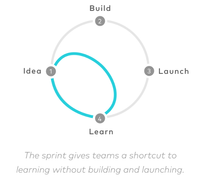
Sprint
A process for quickly iterating on an idea to test a hypothesis through prototyping and customer research.
Generally conducted over several days, Sprints are a focusing exercise for a cross-functional team to uncover solutions to customers' problems without investing extensive time and resources into the development of a product without first knowing if it will be successful.
Read more from GV on how to conduct an effective sprint. (Image from gv.com/sprint)

Storyboard
A visual organization of the ideas and structure of a proposed experience in the form of illustrations, images, or screens presented in sequence for the purpose of pre-visualizing and ordering.
Stroke
Also known as a line, a stroke is the visual characteristic of a path or vector.
Strokes are created with the line tool, pen tool, or are the border of shapes. They can be straight or curved, are aligned to the inside, center, or outside of a path.
Stroke style can be customized to solid (default) or dashed and can be capped with round, square, or arrow endpoints.
T
Typeface
A typeface is comprised of a set of letterforms and glyphs that are related by similar design features. Each font of the typeface has a specific identity through its style, weights, slant, ornamentation, and other elements. See also Font Family.
Read more: wikipedia.org/wiki/Typeface
Typography
Originally a term from the print industry, typography is the work or technique of arranging, processing, or setting type, such as letters, symbols, characters, figures, and signs.
The goal is often to make the composed language readable, legible, and aesthetically pleasing to communicate effectively.
Some techniques include the determination of: typefaces, leading, kerning, tracking, line length, point size, style, arrangement, and other characteristics of the type.
Type design is closely related and often considered a part of typography.
U
UI/UX design
UI = User Interface; UX = User Experience.
Design of user interfaces and experiences is also commonly referred to as Product Design or Screen Design, in reference to the specific products being crafted. UI Design generally focuses on the overall feel of a product, including its visual design. UX Design is concentrated around the storytelling and customer journey aspects of a product such as a website or an app.
Usability
The extent to which a product or service is easy, intuitive, and efficient to use to achieve specific customer goals.
V
Vector
A type of graphic, vectors are shapes or images that are created with points, each defined by an x and y coordinate, and paths that connect the points to create lines and enclosed shapes. The coordinate and path mathematical data is interpreted and rendered by browsers and creative tools.
Vector images or graphics can be scaled to any size or examined at extreme zoom levels, versus pixel-based images (raster graphics) which can appear blurry or pixelated when scaled.
The word vector can also refer to a particular path or object in a vector graphic.
Common vector file formats are EPS, PDF, and SVG.
W
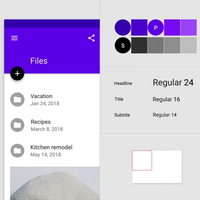
Weight
The thickness of a stroke or a letterform’s stroke.
A typeface can range in weights from hairline to ultra-black and have many fonts in between, while some typefaces may come in only one weight.
These weights also have a number association, which is helpful to understand when programming or working with a developer. Weights generally coordinate to a number on a scale of 100 to 900, with intervals of 100: Regular 400, Medium 500, Semi-Bold 600, Bold 700, etc.
Strokes are generally measured in points.
White space
The space between graphics, columns, images, text, or other objects. Often helps focus the attention on the intended information to better communicate a message. This portion of a design left empty can increase legibility and readability.
See also Negative Space.
Wireframe
Basic shapes or blocks arranged to represent how a website, screen, or page will be interacted with to help diagram the designer's intent. Using simple graphics, like grey rectangles reduces cognitive load by focusing on layout and composition instead of focusing on type, color, or other content decisions.
Read more: usability.gov/how-to-and-tools/methods/wireframing
Get our wireframe kit: Figma wireframe kit
Wordmark
Also known as a logotype, a wordmark is a specific type of logo that contains the name of the company, product, or organization in a graphic style.
These graphic identities help build recognition of the company or product on signage, marketing materials, packaging, letterhead, and more.
An example of a wordmark is the Uber logo.


X
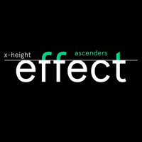
X-Height
In typography, it is the height of a lowercase "x" in a typeface. It meets the baseline and typically defines the line that ascenders cross, known as the midline or mean line. Letters with a bowl such as the lowercase a, b, d, o, and p, in some typefaces, slightly extend beyond the x-height to overlap the baseline and midline/mean line.
Sans Serif typefaces generally have larger x-heights.